CONSTITUENT UNIT'S LOGOS
To maintain brand consistency among the University and University’s Constituent Units, the identity or name of the University should be featured as part of the design of the Constituent Units logo. They should follow the below guidelines and feature them in the corresponding language version.
The standard University combination logo should be placed on the left side while the graphic brand identity, logotype, and/or name of the Constituent Units should be placed on the right side and share the same spacing rules and language order as the standard University combination logo. The graphic brand identity, logotype, and/or name of the Constituent Units should not exceed the height of the University combination logo. Please see examples as shown for guidelines on the size, spacing, and minimum clear space.
For Constituent Units without graphic brand identity:


For Constituent Units with graphic brand identity:


(For reference only)
STANDARD TYPEFACE FOR CONSTITUENT UNIT'S LOGO
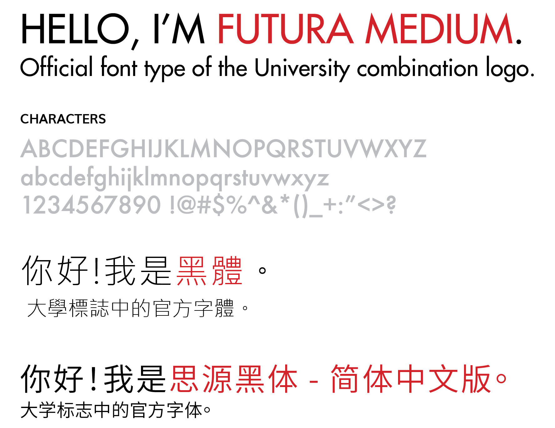
The Constituent Unit’s logo should follow the Standard University Combination Logo Typeface:
ENGLISH: Futura Medium
Traditional Chinese: 黑體
Simplified Chinese: 思源黑体 – 简体中文版
If a Constituent Unit’s logo consists of the full name or abbreviated name of the University, the typeface of the University name should be in Futura Medium for English, 黑體 for Traditional Chinese and 思源黑体 – 简体中文版 for Simplified Chinese.

